Category Archives: Design

White Crow Papermill and art processes

We went to the White Crow Papermill in Fleetwood, Pa today with some of the people in my department. Making paper has always interested me. It was definitely refreshing to see some of the alternative ways that they made paper. One of the professors in the art department owns this place so that’s why we visited them. Sometimes in art, there are specific processes that are needed to be done in order to get the right outcome and until you’ve mastered the original process, only then you can start experimenting. But paper making isn’t that rigid. I mean, you have a basic process, but you don’t necessarily have to use the same tools to recreate the end product.

He did these really cool artworks where he embedded different pieces of paper and then ‘casted’ them so the pieces blended into the surface so its’ smooth.

Camp Chronicles Series

58″ x 40″ handcast and mixed media paper

iSad

Moments after news broke about Steve Jobs’ death, a rainbow popped out of the Pixar campus (taken with my iPhone 4). Rest in peace, Steve, and thank you. SOURCE
Steve Jobs bought a small studio, “The Graphics Group” in 1986 and later renamed is “Pixar”.

iSad. We Sad. World Sad.

“Apple has lost a visionary and creative genius, and the world has lost an amazing human being. Those of us who have been fortunate enough to know and work with Steve have lost a dear friend and an inspiring mentor. Steve leaves behind a company that only he could have built, and his spirit will forever be the foundation of Apple.” – Apple.com/stevejobs 

As some of the readers of the blog may know, I am one who does not believe in coincidences. I honestly believe the rainbow above Pixar is a mystical occurrence, photographic evidence of someone achieving the Rainbow Body of Light taught in Buddhism. The timing of the rainbow is impeccable and instantly awakens the questioning mind. Interestingly an article was published today by CNN journaling Jobs’ philosophy and spirituality:

The name of Jobs’ company is said to be inspired by the Beatles’ Apple Corps, which repeatedly sued the electronics maker for trademark infringement until signing an exclusive digital distribution deal with iTunes. Like the Beatles, Jobs took a spiritual retreat to India and regularly walked around his neighborhood and the office barefoot.  

Traversing India sparked Jobs’ conversion to Buddhism. Kobun Chino, a monk, presided over his wedding to Laurene Powell, a Stanford University MBA. SOURCE

 Even Job’s said himself that he doesn’t believe in coincidences:

 “I believe life is an intelligent thing, that things aren’t random,” Jobs said in a 1997 interview with Time, providing a glimpse into his complicated belief system that extends well beyond the Buddhist teachings. SOURCE

According to an article published by The Red Dragon Shop,

The ultimate Great Completion culmination is the Rainbow or Body of Light attainment. This is widely recognized as a sign of extreme sanctity in Tibetan Buddhism and among the Bönpo.  [..] The Rainbow Body – The Body of Light is light without shadow; it is awareness without obscurations; it is omniscience; it is pure space. […] The Body of Light represents a complete and total and radical transformation of one’s status of being, a rediscovery of what was primordially present, and this condition is permanent. It is Awareness itself and is dependent on nothing else.

Sogyal Rinpoche wrote,

In 1952 there was a famous instance of the rainbow body in the East of Tibet, witnessed by many people. The man who attained it, Sonam Namgyal, was the father of my tutor at the beginning of this book. He was a very simple, humble person, who made his way as an itinerant stone carver, carving mantras and sacred texts. Some say he had been a hunter in his youth, and had received a teaching from a great master. No one really knew he was a practitioner; he was truly called a “hidden yogin.” . . . he then fell ill, or seemed to, but became strangely, increasingly happy. When he illness got worse, his family called in masters and doctors.

His son told him he should remember, ‘Everything is illusion, but I am confident that all is well.’ Just before his death at seventy-nine, he said “All I ask is that when I die, don’t move my body for a week.” When he died his family wrapped his body and invited Lamas and monks to come and practice for him. They placed the body in a small room in the house, and they could not help noticing that although he had been a tall person, they had no trouble getting it in, as if he were becoming smaller. At the same time, an extraodinary display of rainbow-coloured light was seen all around the house. When they looked into the room on the sixth day, they saw that the body was getting smaller and smaller. On the eight day after his death, the morning in which the funeral had been arranged, the undertakers arrived to collect the body. When they undid its coverings, they found nothing inside but his nails and hair.

Those who have mastered the trek-chod phase of Dzogchen in which pure and total presence is stabilized, are able to do to-gal. This is the final Dzogchen practice which enables the yogi at the time of death to dissolve his or her physical body into the essence of the elements.

The above photo was taken (on my cell phone so sorry for the quality) when I was traveling to Cancun, Mexico, which turned out to be one of the most mystical experiences I’ve had, in the most sublime way (everything ended up being related to the Orion constellation, I wrote about it here). 
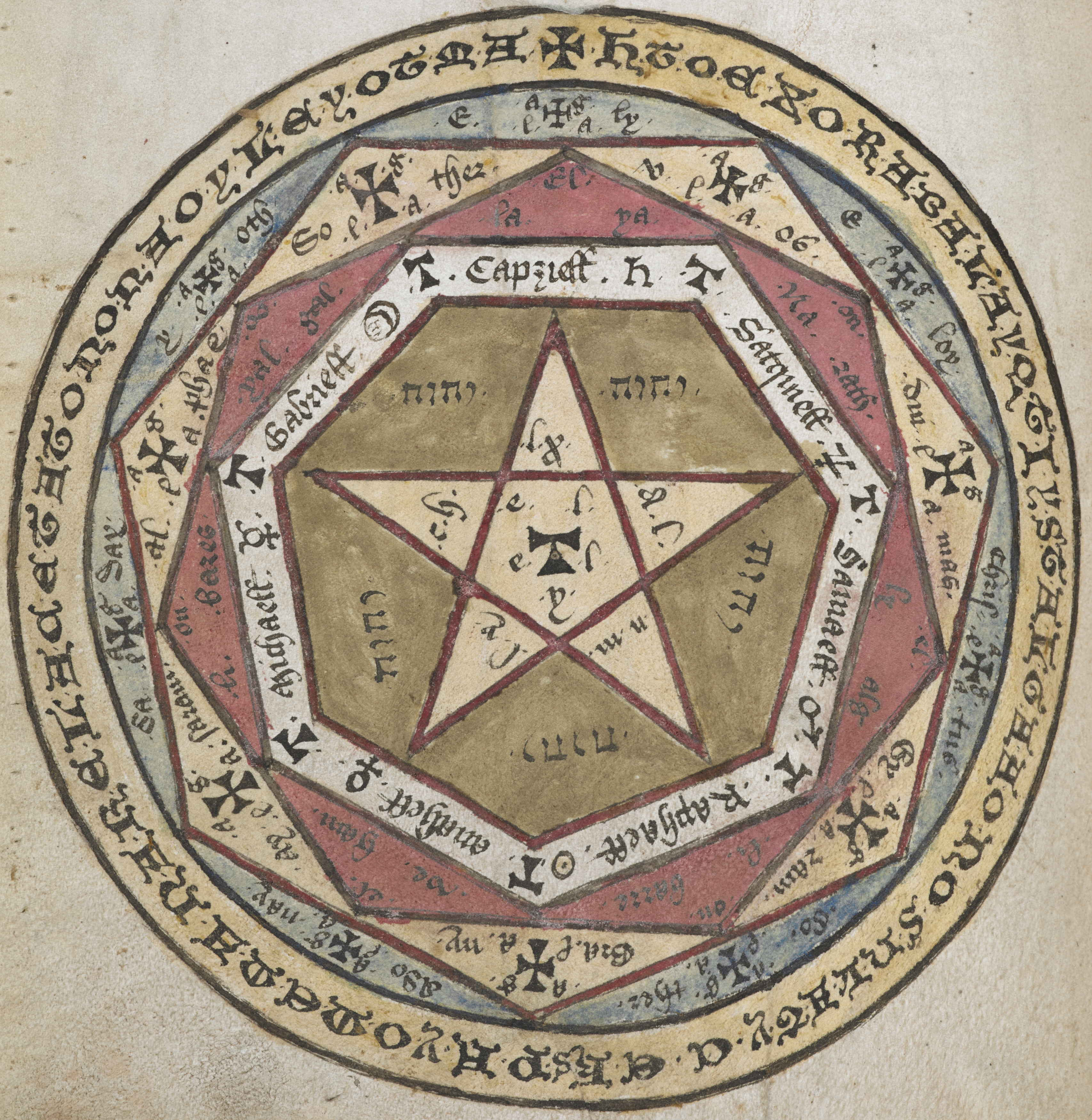
While I was riding in the air plane, I kept noticing this rainbow bubble (mid picture to the right) that was following the direction of the plane. It only appeared when we were over a cloudy area. The sun was low on the other side of the airplane so it couldn’t have been a reflection or light shining on a reflective spot on the plane. I have completely forgotten about it until now because it reminds me of the rainbow bodies of light illustrated in this picture!: 
It just occurred to me that the old apple logo was a rainbow:

Semiotics: the study of Signs

This is probably a premature decision. But I’m currently inspired and moved to go to University of Tartu in Estonia to get a Master’s degree in Semiotics…the study of signs and sign processes (semiosis), indication, designation, likeness, analogy, metaphor, symbolism, signification, and communication.

Its basically a combination of philosophy, linguistics and communication. I figured it might really help me with graphic design career. Why Estonia? It’s under 10k for a two year master program probably half the cost of a US Master’s program… and I can probably afford it and its’ abroad! I never studied abroad. And really still want to at some point, or work abroad… either or. Also the University of Tartu is the center for Semiotics.. so they’re really into the subject which is pretty new and blossoming.

Here’s the program from the University of Tartu’s semiotics department website fora 2-year master program taught in English:

Program Outline
General module

History of Semiotics: Basic Concepts and
                               Classical Works
Tartu-Moscow Semiotic School
Readings of J. v. Uexküll and J. Lotman
Methodology for Semiotic Analysis

Culture module

Cultural Semiotics and Theories of Culture
Semiotics of Art
Semiotics of Translation
Semiotic Analysis of Performance and
                               Multimediality

Nature module

Biosemiotics
Ecosemiotics: Cultural Interpretations of Nature
Zoosemiotics: Umwelt and Animal Communication
Landscape Semiotics

Society module

Sociosemiotics and Societal Theories
Ideology and the Concept of Identity
Models of Communication and Mass Media
Semiotic Analysis of Subcultures

Optional courses


Master thesis

We’ll see though…

First I graduate…. and get an internship and then work some…. or for awhile.

Santorini / Semeion Apothecary Package Design

So this is just a concept mockup that I have going on with the semeion apothecary package design. Not sure how I like it… I’m going to be making my own jar this friday out of a homemade clay that has the look and feel of porcelain and kind of like the adobe used in greece such as the above image. Something like below but more what I’m going for:

Apothecary style logo

We’ve got a package design project coming up. I love package design and being the nerd I am, I’ve started on it early cause I had an idea and I wanted to get a comp done.

I spent a good portion of this evening working on client projects. I’ve got two going on right now for music orientated clients. One wants a sign and other print materials and the other wants a website makeover. Both are going pretty well.

Had sometime before I head off to bed. I recently did a poster for a made-up apothecary advertising its’ herbs and other medicinal things… and I called it “The Semeion Apothecary”.  Semeion means sign, or mark in greek and comes from the subject, Semiotics; the study of signs. I thought it might be cool to do a package design concept based off this idea.

Just testing out some ideas based off the poster I did. We had to do two self-initiated projects before the 28th of september and I did a brochure and this poster.

I wasn’t too happy with it because I did it in a day since I had no motivation for it and had no direction, ideas, concepts, etc. I think it turned out pretty good for doing it in less than 24 hours.

There are definitely things I could change though.

Here is my brochure:

I like how this brochure turned out and yes, I know “Sirius in Popular Culture” should be capitalized.

Disney Institute

So this past month I got my application together to apply for the Graphic Design Communications internship at the Disney Institute at Lake Buena Vista in Florida.

This week I got an email from them to schedule a phone interview for next friday! Basically to talk about my interests, skills and experience. Very excited.

Let’s hope it goes well.
They said I was a strong candidate so I thought that was cool.

‘pologies for the lack of posts. Not been feeling great/been busy with school. My digestive system decided to go last weekend and its been messed up since. Had the worst cramps for the first time in three years and today I suffered from a miniature migraine. I took Tylenol which didn’t do anything and then napped for three hours and felt gross and groggy when I woke up. But the piercing headache is gone. It may just be stress… sometimes my body reacts to stress even though I don’t feel stress or pressure.

I had to miss gym on Wednesday night because since I was sick over the weekend I fell behind in my homework and projects. Way behind and stayed up late monday and tuesday but I still forgot to do one thing for Tuesday which I did yesterday for today. I was told by my instructor that I couldn’t miss any gym… and would have to get the excuse approved… sigh! but I took a gym class last year and was told I could miss two classes… I need this gym class for credit to graduate. It will probably be no big deal and will be approved but I’m getting more stressed with every road block that I cross for me to graduate early!

First I have to get a letter written for the dean to appeal a grade I got over the summer for a class I took for credit because it wasn’t high enough. Second Jan (the secretary from the art department) and I realized that I’m a quarter credit short! URGH. So we decided to make studiosouth an internship for me for the second half of the semester so I can get the quarter credit… I still have to get the paper work for it… but yeah…

and now this gym class miscommunication pffft! The world doesn’t want me to graduate early…

and if I get that internship (really really hoping I do) I really -do- need to graduate early!

SIGH

5 Book Covers

Haven’t gotten a grade for this yet… this is one of my 5 book covers I had to do in a week and then do corrections for. Sorry for the quality of the images, I’ve taken them with my cell phone, I’ll take better ones for my portfolio later. I’m just really pleased with this cover.

Although when I was trimming these, I accidentally somehow had sliced a little onto the cover itself and had to fix it with tape… so professional I know. lol at some point I’ll reprint it.

Anyway, a couple of the others have to be reprinted too (sigh) because some how some of the images got pixelated and one was completely not the right size.

I’ll post them all once they are all completed!

For a teaser here are the spines of most of the others:

Logo Colors

I got an A- on this logo. 🙂 But I still can’t figure out the colors for it. Not sure what to go for. The one below is what I’m currently using. I do like the thinner lines of the logo, but it doesn’t work so well now with the green/gold colors. I like green, but I feel like I’d get tired of it fast. Same with the blue… this is funny because I am all about color usually. The one below is what I turned in. I like it because its colors that I love and its also CMYK (the black would be the text) but most people in the critique said it would be too much going on. I don’t think so though…

I like the above colors as my business card but it didn’t really go well with the rest of the package.

Then the green/gold colors went well with everything else but not the business cards…. =/
So as of now I’m using the green/gold. The green/gold version looks really nice in black and white. 
I may end up just keeping it black and white.
I saw the below this morning … its a brand identity for La Sal Gallery. The name was chosen with help of numerology and the whole idea was to combine two distinct subjects: salt and jewelry into one strong idea. So the designers went with an alchemical theme. They kept it very sleek/corporate looking to keep the scientific feel of it…  But I just found it cool that the logo they came up with looked like it could be apart of mine! (source).

Logo

This is where my personal logo is headed. Before there were a lot of comments on making it less blocky… one idea was to make one “K” more distinct but with this particular design that idea ended up breaking up the unity this one has. Also it does not matter if you cannot tell that it was made out of a ‘k’ that’s the element of surprise, or mystery that I’d rather keep. 
I used the bevel and emboss filters for this and I think it works. My prof liked this one a lot better and I do too. So I think I’m gonna scrap the CMYK idea. CMYK colors are hard to work with because there are four of them. There’s basically only two colors here; the sage green and the gold color.

Brain Coherence

So while I was researching for next project; creating 5 book covers due next wednesday. I’m doing a book cover based on Design Aesthetic Philosophy (or design philosophy, basically what I write about).  I came across a philosopher whom I haven’t heard of; Prof. Arnold Keyserling. He was all about brain coherence and the grammar of the brain. To me, Graphic Design is thinking made visual… that’s the definition I go by (while I realize GD has many definitions this is one I found that is most appropriate). I found his use of the enneagram; the nine-pointed star very interesting. 

Keyserling discovered that the structure of our brain molds our speech, and our speech in turn shapes our mind.  He found that the basic patterns of our mind and coherence are tied to language, and all are tied to the Enneagram and The Wheel.  The essential criteria of our mind can be reduced to the three space-like realms of language combined with the four time-like functions.   These are the basic components of The Wheel. (source)  

Logo

The “philosophy of a lightbeam” concept logo turned out to be not everyone’s favorites. There was too much going on. I also realized its not as ‘original’ as the first logo concept I had. 
Here is the modified one in black and white:
I really like how the positive and negative space interacts with one another in the logo and how it still has a great sense of unity. There are also other similar elements from the “philosophy of a lightbeam” concept in this one too. But still having issues where to put “kglyphics”.  Hmm.

Brand Identity Research

So I’ve been doing quite a bit of research on brands and identities and found a lot of great examples on Designspiration.net  and Deviantart.com…  I even have a comp going.. and now am looking for ways to incorporate the text while keeping the unity and balance it currently has.

I’m basing it off the ‘philosophical geometry of a light beam’.
But instead of making it a rainbow I’m making it CMYK and leaving a few things out…
I’m now looking at “Seal Logos” to see how I can better incorporate the text; “K Glyphics”. 
The logo now has a great sense of unity and balance and I want to preserve that.  
Not sure how ancient this will look at the end, but I like the direction that it is going in.
Logos I found that are similar to mine…
The following brand identity has been a big inspiration for mine. Its Pentagram’s NYU Abu Dhabi brand identity.
Here’s what the current comp may look like on a business card: